The presentations today (including ours) went really well in my opinion. However, I don't think there was any question of who the winners were going to be. MechanApp and VisualScheduler had nice presentations and a lot of potential from the very start of the practice presentations. MechanApp had a slick presentation (as usual!) and their website interface is very simple and elegant. VisualScheduler is extremely useful with a nice interface. I think their schedule generator adds a lot of value to their site (on top of the value already added by removing the horror that is scheduling on myUNM!) and, from the sound of it, they are going to turn this into an actual product, which is great. It almost (almost!) makes me wish I wasn't graduating so I could actually try it out.
All the other presentations showed a lot of improvement from the last round of practice presentations. There were almost no glitches and the presentations themselves looked quite professional. I was pretty proud of our team in particular since our initial practice presentations had been so weak (due to lack of practice for the most part). After the optional practice round with Prof. Ackley, we really buckled down and practiced the presentation 10+ times. As I mentioned in a previous post, I also went through and made some edits to the slides, changing the colors, font sizes, and adding graphics, which I think helped make the slides look more professional and less "academic." Overall, I think we improved significantly since Friday (our last practice presentation) and I am glad that we were able to revamp the slides and do a lot of practice because it made a huge difference.
So back at the beginning of the semester, this day seemed so far away. Then suddenly it was the end of April and we were scrambling to wrap up any loose ends before the final presentation. As a team, I think we delivered an application that met our goals, looked pretty polished, and had a presentation to match. I learned a lot from this project, especially since this was my first time using Ruby, Rails, Bootstrap, and Haml and I had only had some limited experience with JavaScript and CSS prior to this. I'm glad that I decided to go with a project that used technologies that I wasn't familiar with since it challenged me and really helped me improve as a software developer. And kudos to everyone on my team; it was good working with you and I learned a lot!
Tuesday, May 13, 2014

Sunday, May 11, 2014
So, does practice really make perfect?
Ok...well maybe not perfect, but certainly it makes you better! Yesterday morning, Matt S., Matt F., Fernando, and I met to practice our presentation. We had made some changes based on Prof. Ackley's feedback (particularly the addition of our slogan--"Help you become a better you") so now we just needed to practice. We were able to practice in the room where the final presentation will be held, which was a great opportunity for us to familiarize ourselves with the projection equipment and figure out whose laptop would work best with the projector's resolution. It was decided that we would use my laptop since the higher resolution projector plays nicely with it.
Once we got everything set up, we went through the slides about five or six times, with Matt F. and Matt S. switching parts (i.e. changing up who would talk through the demo, who would talk through the slides, etc.) to see what worked best. Fernando and I were the audience and judges. In the end, we decided that the best format was to have Matt S. talk though the slides (which, by the end, he was able to do very nicely without any notecards) and to have Matt F. talk through the demo. Since Matt F. was in charge of running the computer, it made it smoother and easier if he also talked through the demo since there would be no possibility of mixing up what was being shown versus what was being said. All in all, it was a very productive few hours and I just wish that we had actually done a lot more practice prior to our practice presentations because we would have done so much better initially. But, at least we are finally practicing now so hopefully the final presentation will go really well.
After the meeting, I started going through the slides for the presentation to make more changes that were brought up during our presentation to Prof. Ackley yesterday. I decided to include a few graphics from the app on some of the slides to break up the monotony of text. I also removed all but the necessary keywords from most of the bullet-points to reduce the overall amount of text. For the bullet-points (not the text, just the bullet-point circles themselves), I reduced the font size significantly and changed their color to green (the same green used in our website) so that they are not so prominent. I think this helped make the slides look a little less academic, which was a criticism that has been brought up during several of our practice presentations.
I still think we might be able to make a few more changes that will improve the overall look and feel of the slides, but at least we have made some significant improvements that I think will help our final presentation.
Once we got everything set up, we went through the slides about five or six times, with Matt F. and Matt S. switching parts (i.e. changing up who would talk through the demo, who would talk through the slides, etc.) to see what worked best. Fernando and I were the audience and judges. In the end, we decided that the best format was to have Matt S. talk though the slides (which, by the end, he was able to do very nicely without any notecards) and to have Matt F. talk through the demo. Since Matt F. was in charge of running the computer, it made it smoother and easier if he also talked through the demo since there would be no possibility of mixing up what was being shown versus what was being said. All in all, it was a very productive few hours and I just wish that we had actually done a lot more practice prior to our practice presentations because we would have done so much better initially. But, at least we are finally practicing now so hopefully the final presentation will go really well.
After the meeting, I started going through the slides for the presentation to make more changes that were brought up during our presentation to Prof. Ackley yesterday. I decided to include a few graphics from the app on some of the slides to break up the monotony of text. I also removed all but the necessary keywords from most of the bullet-points to reduce the overall amount of text. For the bullet-points (not the text, just the bullet-point circles themselves), I reduced the font size significantly and changed their color to green (the same green used in our website) so that they are not so prominent. I think this helped make the slides look a little less academic, which was a criticism that has been brought up during several of our practice presentations.
I still think we might be able to make a few more changes that will improve the overall look and feel of the slides, but at least we have made some significant improvements that I think will help our final presentation.
That dang checkin button...again!
As I had written a few posts back, we had been having issues with the Checkin button; it was not disabling when it should and we had initially traced the problem back to the abandon challenge functionality, where certain records were not being removed and were being associated with the wrong challenge. So, I had fixed this issue...I thought. Then it starts appearing again without any apparent rhyme or reason. When it showed up in our presentation this morning, that was the last straw. As soon as I got home, I started combing through the code again to try to figure out what I had overlooked last time. I cleaned out my database and started taking challenges, abandoning challenges, completing challenges and....ah ha! I found where the bug was occurring. When you completed a 1 checkin challenge and then went to take another challenge within that same week, a date range search was being done in order to find the latest week record associated with the current challenge. Problem was, this was being called with ".first" to return on the first matching record. Thus, if two challenges were completed within the same week by the same user, the week record associated with the first challenge taken would be returned instead of the latest week record. Fixing this issue was a simple matter of replacing ".first" with ".last".
I did some testing after this fix to make sure that it was all working correctly and everything appears to be functioning as expected. I also made a small change to the abandon challenge functionality to make sure that all the Week and History records associated with the abandoned challenge are deleted so that they do not end up causing issues later on.
I did some testing after this fix to make sure that it was all working correctly and everything appears to be functioning as expected. I also made a small change to the abandon challenge functionality to make sure that all the Week and History records associated with the abandoned challenge are deleted so that they do not end up causing issues later on.
Saturday, May 10, 2014
Practice presentation...again
We had volunteered for a final practice presentation with Prof. Ackley yesterday morning. I think it was good that we did it because it is always helpful to get feedback. I think our biggest issue with our presentation is lack of practice. I think we really need to just sit down and run through it at least five or six times in order to figure out what works and what doesn't. You can have a decent presentation, but it won't have much impact if it isn't practiced and smooth.
Prof. Ackley also brought up a lot of things that we can change to make our presentation better. For instance, having a slogan ("Help make you a better you") and, at a minimum, using this slogan in the first and final slides. Also, and this is something I have brought up a previous meetings, we need to justify the honor system choice--i.e. if the user cheats they are only harming themselves. Regarding the competition, we should have more "damning with faint praise" for competitors to help emphasize what sets us apparent from these other applications and why we are "better".
The demo of the app itself still had some glitches and there was some confusion about whether we should show a user signing up (this was nixed as not a good idea) or just logging in. Also, initially starting with taking a simple, pre-made challenge (like "Check-in for signing up" or something similar) would be better than jumping into creating a challenge (though this can be done a little later, since it is an important feature of our application). I also think that whoever does the actual run-through of the slides should be the one whose Facebook account is used since this is less confusing than trying to switch accounts all the time. Prof. Ackley also mentioned that we should try to unify the fonts on our site a little more to go with our mostly lowercase theme. This is something that I finished working on last night so now the font capitalization looks a little more cohesive.
Prof. Ackley also brought up a lot of things that we can change to make our presentation better. For instance, having a slogan ("Help make you a better you") and, at a minimum, using this slogan in the first and final slides. Also, and this is something I have brought up a previous meetings, we need to justify the honor system choice--i.e. if the user cheats they are only harming themselves. Regarding the competition, we should have more "damning with faint praise" for competitors to help emphasize what sets us apparent from these other applications and why we are "better".
The demo of the app itself still had some glitches and there was some confusion about whether we should show a user signing up (this was nixed as not a good idea) or just logging in. Also, initially starting with taking a simple, pre-made challenge (like "Check-in for signing up" or something similar) would be better than jumping into creating a challenge (though this can be done a little later, since it is an important feature of our application). I also think that whoever does the actual run-through of the slides should be the one whose Facebook account is used since this is less confusing than trying to switch accounts all the time. Prof. Ackley also mentioned that we should try to unify the fonts on our site a little more to go with our mostly lowercase theme. This is something that I finished working on last night so now the font capitalization looks a little more cohesive.
Friday, May 9, 2014
Debugging
Yesterday I ran through the website again, doing some randomized testing (i.e. just clicking on buttons in no particular order to make sure things are working) and found an issue with challenges that have parent challenges (i.e. where there are levels of challenges). If, for example, you click a level 2 challenge and you have not yet taken the level 1 challenge, the display modal just shows a button saying "View Parent Challenge". However, I discovered that this button was not actually "hooked up" to anything. So, I spent about an hour googling around and trying to figure out how to get a modal to refresh its content while it is being displayed. After some frustration, I found that some simple jQuery:
worked perfectly. It clears out the old content so that the new content can be loaded (in this case, the new content is the information about the parent challenge).
As I was testing this fix, I found some problems with the .csv file that is used to seed the challenges in the database. Some of the challenges were not having their parent challenges set properly and therefore were not being displayed as child challenges in the application. I went through the list and fixed this issue so that the challenges will now be correctly associated with their parent.
$(document).ready(function(){
$('.modal-id-here').on('hide.bs.modal', function () {
$('.modal-id-here').removeData();
});
});
worked perfectly. It clears out the old content so that the new content can be loaded (in this case, the new content is the information about the parent challenge).
As I was testing this fix, I found some problems with the .csv file that is used to seed the challenges in the database. Some of the challenges were not having their parent challenges set properly and therefore were not being displayed as child challenges in the application. I went through the list and fixed this issue so that the challenges will now be correctly associated with their parent.
Wednesday, May 7, 2014
Ruby on Rails...then and now
I was thinking about my impression of Ruby on Rails now that I've been working with it for ~12 weeks. I had to learn a language that was very different from what I'm used to (Java, C, and C++), which was a little intimidating. I had picked Demigod partly because of the idea itself but also because of the opportunity to learn something more than just Java. I could have gone with a project that had more familiar tools, but I decided to try out something different and I'm glad I did. As frustrating as it was initially trying to remember how models, views, and controllers fit together (not to mention the seventh circle of hell that is setting up Ruby) and where a certain file is located in the maze of folders that makes up a Rails project, I felt I was finally (around week 4 or 5) able to really start making sense of it all.
As someone who is used to working in Java (school and work) with some C and Scheme/Haskell classes thrown in for good measure, I don't have much opportunity to work in other languages unless they are my own personal projects. I've taught myself the basics of Javascript, HTML, and CSS through some of my own projects, but it is never quite the same as having to work on a relatively large project in an unfamiliar language. I think it is a little like learning an actual language: you can take a lot of classes and practice as much as you like, but nothing is better for learning that going to the actual country and immersing yourself in the language. Having a large project is somewhat like that. You have to immerse yourself in the language so you can understand as much as possible as quickly as possible, otherwise there is no way that you can be a functioning member of the team. Though learning RoR could be quite a challenge at times, I think it worked well for our project and we were able to implement all the necessary functionality, create a good layout and design, and deliver a final project that met our requirements. For me, that indicates that the choice of language was a good one. If your language of choice does what you need in a relatively simple and efficient manner, then I say it was the right language for the job. As with any language, there are unique issues and problems that you have to overcome, but, overall, RoR worked for our project.
As someone who is used to working in Java (school and work) with some C and Scheme/Haskell classes thrown in for good measure, I don't have much opportunity to work in other languages unless they are my own personal projects. I've taught myself the basics of Javascript, HTML, and CSS through some of my own projects, but it is never quite the same as having to work on a relatively large project in an unfamiliar language. I think it is a little like learning an actual language: you can take a lot of classes and practice as much as you like, but nothing is better for learning that going to the actual country and immersing yourself in the language. Having a large project is somewhat like that. You have to immerse yourself in the language so you can understand as much as possible as quickly as possible, otherwise there is no way that you can be a functioning member of the team. Though learning RoR could be quite a challenge at times, I think it worked well for our project and we were able to implement all the necessary functionality, create a good layout and design, and deliver a final project that met our requirements. For me, that indicates that the choice of language was a good one. If your language of choice does what you need in a relatively simple and efficient manner, then I say it was the right language for the job. As with any language, there are unique issues and problems that you have to overcome, but, overall, RoR worked for our project.
Sunday, May 4, 2014
Meeting: Clean up and fixes
We had a meeting today to make some final updates/improves to the code and go over our presentation. I updated the code that determines when the user can check-in and what defines a "day" and a "week" is. Previously, for testing purposes, we had set a day to be 20 seconds and a week to be 7*20 s = 140 seconds. This made it much easier to test the current progress code to ensure it was working as expected.
So I make the changes and run the code and...it breaks. When I take a challenge and check-in, everything is fine. But once I complete my first check-in, the "Checkin" button should then be greyed-out until 24 hours later since check-ins are permitted only once per 24 hours. However, the Checkin button is not disabled and I can click it until I finish the challenge. I ask Fernando to run his copy of the code with the seconds usage just to make sure that changing the timing didn't mess things ups. Well, the version of the code on his machine is behaving perfectly fine so I run grep in the command line to make sure that I have replaced all instances of 20.second and 140.second (rails handy way of giving a number of seconds) with 1.day and 7.day. There are no lingering occurrences so I comb through the Javascript for the current challenge progress bar to make sure that I haven't missed some code that might be messing up the timing. Nope, everything looks to be in order.
I clear out my database and take a challenge again. It works fine this time! I then login to my Facebook account and take a challenge there to make it is still working and...it breaks! The Checkin button doesn't disable after the first check-in. So it appears that this problem is caused when two or more users are all taking challenges (not necessarily the same ones) at the same time. Obviously, this is a major problem since our app should be able to handle this fine.
Matt S. and I start looking over the user's controller (which is where most of the methods that run the current progress bar are placed). We also query the database from the Rails console and notice some inconsistencies in the way the weeks and user challenges are being saved in the database. It appears that the wrong week record is being associated with the wrong user when the user is taking a challenge. We skim through the methods in the user's controller to see if we spot a place where the database is being accessed without specifying the current user id. Nothing. We can't find anything out of place so I go back to looking over the presentation.
However, the issue is still bugging me since it is a major problem with the logic of the code. I decide to go over the user's controller once again and finally find the problem. A "where" query is being run on the Weeks model but the current user id is not being passed in so there is the potential for a week record from another user to be returned for the current challenge depending on the matching results returned by the query. Once the current user id is specified in the query, I clear out the database and take challenges in both my administrator account and my Facebook account. Now the Checkin button is properly disabled no matter which account I am in.
So, problem is solved! Not quite. About an hour later, I find that it shows up again, but only after the Abandon a challenge button is pressed. After some digging around in the user challenge model (where the abandon challenge method is located), we discover that the Week records for an abandoned challenge are not being deleted and are causing issues when the next challenge is taken. After adding a line to delete all the Week records for the abandoned challenge, the code runs correctly.
We also spent some time going over the presentation and how we are going to do the demo. Next weekend, we'll meet to really hammer it out and hopefully, if we can get access to the room we will be presenting in, we can also practice in there, which would be really nice.
So I make the changes and run the code and...it breaks. When I take a challenge and check-in, everything is fine. But once I complete my first check-in, the "Checkin" button should then be greyed-out until 24 hours later since check-ins are permitted only once per 24 hours. However, the Checkin button is not disabled and I can click it until I finish the challenge. I ask Fernando to run his copy of the code with the seconds usage just to make sure that changing the timing didn't mess things ups. Well, the version of the code on his machine is behaving perfectly fine so I run grep in the command line to make sure that I have replaced all instances of 20.second and 140.second (rails handy way of giving a number of seconds) with 1.day and 7.day. There are no lingering occurrences so I comb through the Javascript for the current challenge progress bar to make sure that I haven't missed some code that might be messing up the timing. Nope, everything looks to be in order.
I clear out my database and take a challenge again. It works fine this time! I then login to my Facebook account and take a challenge there to make it is still working and...it breaks! The Checkin button doesn't disable after the first check-in. So it appears that this problem is caused when two or more users are all taking challenges (not necessarily the same ones) at the same time. Obviously, this is a major problem since our app should be able to handle this fine.
Matt S. and I start looking over the user's controller (which is where most of the methods that run the current progress bar are placed). We also query the database from the Rails console and notice some inconsistencies in the way the weeks and user challenges are being saved in the database. It appears that the wrong week record is being associated with the wrong user when the user is taking a challenge. We skim through the methods in the user's controller to see if we spot a place where the database is being accessed without specifying the current user id. Nothing. We can't find anything out of place so I go back to looking over the presentation.
However, the issue is still bugging me since it is a major problem with the logic of the code. I decide to go over the user's controller once again and finally find the problem. A "where" query is being run on the Weeks model but the current user id is not being passed in so there is the potential for a week record from another user to be returned for the current challenge depending on the matching results returned by the query. Once the current user id is specified in the query, I clear out the database and take challenges in both my administrator account and my Facebook account. Now the Checkin button is properly disabled no matter which account I am in.
So, problem is solved! Not quite. About an hour later, I find that it shows up again, but only after the Abandon a challenge button is pressed. After some digging around in the user challenge model (where the abandon challenge method is located), we discover that the Week records for an abandoned challenge are not being deleted and are causing issues when the next challenge is taken. After adding a line to delete all the Week records for the abandoned challenge, the code runs correctly.
We also spent some time going over the presentation and how we are going to do the demo. Next weekend, we'll meet to really hammer it out and hopefully, if we can get access to the room we will be presenting in, we can also practice in there, which would be really nice.
Wednesday, April 30, 2014
Footers
I was poking around the app some more yesterday morning and noticed that the footer was only appearing in the homepage when the user wasn't logged in. In most websites, the footer is part of the overall website template, so it almost always appears at the bottom of every page. Thus, I decided to move the footer code from the main page layout view to the application view so that it would be rendered on every page.
After moving the footer code and checking some pages on the app, I thought that everything was good. Then, I decided to sign out and then sign back in and discovered that the footer was not "sticky", i.e. if the content of the page was not tall enough to push the footer to the bottom, then the footer would just appear somewhere in the middle of the page. So I set about looking for solutions to this issue. I found several sites that listed out possibilities for getting the footer to work, but this site provided the best instructions. I had to adjust the margin padding to fit the smaller (84px) size of our footer, but other than that, the code worked pretty much as is. It is very important to add the CSS for having the height of the html and body set at 100% (I forgot to add this in the first time and nothing worked).
So, once again, I though I was done, but not so fast! I did more testing yesterday afternoon and found that the challenge category descriptions were still displaying the footer in the middle of the page. I looked through the views for these pages and discovered that the text had not been placed in a separate container. So, I wrapped the text in a new section and container and put some padding between the text and the title for each description page. I also changed all the line breaks to paragraphs, since this allows for cleaner and more flexible styling. Once these changes were complete, the footer "stuck" to the bottom of these pages as well.
After moving the footer code and checking some pages on the app, I thought that everything was good. Then, I decided to sign out and then sign back in and discovered that the footer was not "sticky", i.e. if the content of the page was not tall enough to push the footer to the bottom, then the footer would just appear somewhere in the middle of the page. So I set about looking for solutions to this issue. I found several sites that listed out possibilities for getting the footer to work, but this site provided the best instructions. I had to adjust the margin padding to fit the smaller (84px) size of our footer, but other than that, the code worked pretty much as is. It is very important to add the CSS for having the height of the html and body set at 100% (I forgot to add this in the first time and nothing worked).
So, once again, I though I was done, but not so fast! I did more testing yesterday afternoon and found that the challenge category descriptions were still displaying the footer in the middle of the page. I looked through the views for these pages and discovered that the text had not been placed in a separate container. So, I wrapped the text in a new section and container and put some padding between the text and the title for each description page. I also changed all the line breaks to paragraphs, since this allows for cleaner and more flexible styling. Once these changes were complete, the footer "stuck" to the bottom of these pages as well.
Forgot password?
I was doing some more testing of our app yesterday--basically just trying sequences of actions that I could see a user doing. While doing this, I ran into an issue with the "Forgot Password" link that is displayed on the login form. When I clicked this link, it displayed a form where I could enter my email to have my password reset (which I had to restyle with CSS since it had accidentally been missed when I had redesigned the login and signup forms). However, when I clicked the button to have the application send an email to the provided address, the app blew up with an error message that said (in the true cryptic fashion of most error messages): "Missing host to link to! Please provide the :host parameter, set default_url_options[:host], or set :only_path to true". Essentially, this was telling me that the mailer for the application was not set up.
So I did some googling and found this blog post on mailer setup and this related blog post on environment variables. I was able to modify the instructions in the first blog post (with hard coded values for the mailer settings since at this point I just wanted to make sure it worked) and added these lines to the development.rb file (since I was just testing it locally):
So I did some googling and found this blog post on mailer setup and this related blog post on environment variables. I was able to modify the instructions in the first blog post (with hard coded values for the mailer settings since at this point I just wanted to make sure it worked) and added these lines to the development.rb file (since I was just testing it locally):
config.action_mailer.delivery_method = :smtp
config.action_mailer.smtp_settings = {
address: "smtp.gmail.com",
port: 587,
domain: "domain.com",
authentication: "plain",
enable_starttls_auto: true,
user_name: "user@domain.com",
password: "password123456"
}
Obviously, the domain, user_name, and password fields are just filled in with nonsense values for the purposes of this example, but, for testing, I filled them in with my gmail account information so I could make sure everything was working. I also added this
config.action_mailer.default_url_options = { :host => 'localhost:7777' }
to the development.rb file so that the mailer would work on the localhost setup (port 7777 is used instead of 3000 because we have Facebook authentication).
Once these changes have been made, the server needs to be restarted in order for the changes to take affect (which I forgot the first time and therefore spent several frustrating minutes trying to figure out what I did wrong).
Now, to ensure that the username and password for the mailer is not available for anyone with some computer skills to see, environment variables need to be used. This is where I need to discuss how to handle this with my teammates, since it appears that this requires setting up another gem called "foreman", which changes quite a few things about the app (including how the webserver is started) so we need to make sure that this will work without breaking other parts of the app. Fernando also has the same issue with code that he had added for a contact form so we need to figure out how to hide the username and password from the rest of world.
Monday, April 28, 2014
Presentation reactions
Today we had the final round of practice presentations before the final. Each of the groups showed improvements over their previous presentations, though there were still some a few issues to work out before the final. My reactions:
Automaton
Automaton
- The explanation of the app was much clearer and easier to follow than last time. I liked that they had included a slide explaining the more important parts of the game.
- The demo itself was also a little easier to understand (and I noticed that they added tooltips over the icons that are dragged and dropped onto the main board). However, if I was someone who was using this app for the first time, I feel like I might really struggle to understand what is going on and what is expected to complete a certain level. My suggestion for them would be to include a demo tutorial on a simple level so the user can see how everything works before they start on their own.
- Handout is good, but I agree with Fernando that the blue is too dark. I looked back at their previous hand-out and the blue on that one was much lighter (maybe due to using a different printer) and was much easier to read.
- The presenters themselves did better than last time, though the demo did seem to go by really fast, so slowing down the talking will probably be good for the final presentation.
- They mentioned that a user can create and upload a level but didn't demo it...maybe this could be something they could include as well to add some time to the presentation.
VisualScheduler
- The slides had more of an impact this time, especially the one containing the ridiculous number of windows that you must click through just to find and register for once class on myUNM (though the sheer number of windows also made some of the text on the slide go out of the display zone, so this should probably be fixed).
- I noticed that they had moved the calendar feature to be below the list of classes. Personally, I'd prefer it in another tab as well since I hate scrolling, but this way does provide a quick way to check if your schedule has conflicts.
- Not related to the presentation, but I like their addition of the automated schedule generator. That is a pretty nice feature since I (and probably every other student at UNM) has to go through the agony of trying to determine how to create a "nice" schedule that includes all the classes you need to take.
- Also noticed that Zach kept looking up at the slides and turning his whole body away from the audience, which was distracting and seemed to imply that he was really relying on the slides for guidance instead of just turning to them to point something out, gesture to something, etc.
G.E.R.A
- Not sure exactly how to spell G.E.R.A. Is it is G.E.R.A or G.E.R.A. (with a period after the "A"?). The slides had both versions while the handout and the website only appears to have G.E.R.A (with no period after the A). I would assume that since it is an abbreviation, it would have the period after the A, but I'm not sure what they are going for.
- The handout was much easier to read, though they did include a pie chart on a dark background with tiny, dark grey text that was impossible to read. I think that this should either be removed entirely or the colors should be changed.
- They mentioned spendable points during the presentation but didn't really explain what exactly these bought. I'm assuming that it would be buying things from the "Armory", but it wasn't really clear.
- The presentation itself was much improved. It appeared that Ben made a real effort to memorize his notecards, which helped a lot and made the presentation flow better and look more convincing. He did mess up on one slide, but if he can power through his mistakes instead of focusing on them, I think he will have a pretty good presentation.
Presentation meeting
Yesterday we met to finalize our presentation. We finished adding in information about the competition and some statistics on the decline of educational performance in America (related to the need for our Intellectual challenges). I also made a few changes to the CSS for the homepage, reducing the height of the footer so that it was not overly large in comparison with other elements on the page. Additionally, Matt S. noticed that the "Abandon" button (allowing the user to abandon a challenge) was disabled when the check-in button was disabled. This was because, originally, this button was meant to be the "Fail" button but we found that this really didn't serve a purpose in our application so we changed it to "Abandon." Given the new context of the button, the user should be allowed to abandon a challenge whenever they want, so the disabling was removed.
Fernando suggested integrating a FAQ into the website, which he created a Google doc for. I think this is a good idea since having a quick reference guide for the user can be quite helpful for improving the overall user experience. I have been adding to it (as have Fernando, Matt S., and Matt F.) so hopefully we can get this integrated into the website this week.
Over the next couple of weekends, we will probably meet to run through the presentation so that it is smoother than last time and so that we can work through any bugs (such as the Facebook fiasco during our last presentation). I do hope that we can get access to the room where our final presentation will be held prior to May 13th since this would be very helpful for making sure the presentation goes as smoothly as possible.
Regarding marketing, I have been posting to my Facebook page via Demigod, so maybe it will entice someone to check it out before our final demo. I also plan to giving the link to a few friends and family over the next few weeks so they can try it out. It might also be a good idea to post up a few flyers around campus...you never know who may bite!
Fernando suggested integrating a FAQ into the website, which he created a Google doc for. I think this is a good idea since having a quick reference guide for the user can be quite helpful for improving the overall user experience. I have been adding to it (as have Fernando, Matt S., and Matt F.) so hopefully we can get this integrated into the website this week.
Over the next couple of weekends, we will probably meet to run through the presentation so that it is smoother than last time and so that we can work through any bugs (such as the Facebook fiasco during our last presentation). I do hope that we can get access to the room where our final presentation will be held prior to May 13th since this would be very helpful for making sure the presentation goes as smoothly as possible.
Regarding marketing, I have been posting to my Facebook page via Demigod, so maybe it will entice someone to check it out before our final demo. I also plan to giving the link to a few friends and family over the next few weeks so they can try it out. It might also be a good idea to post up a few flyers around campus...you never know who may bite!
Wednesday, April 23, 2014
Presentation and code fixes
I worked on the presentation a little today. I added information about Demigod's competition (Fitocracy, DailyBurn, etc.) so we can utilize the Goldilocks method to justify why Demigod is different. I also broke out the "three stages to implementing healthy behavior" into three separate slides and added information on how Demigod helps users move through these three stages and build healthy habits.
We still need to work on a conclusion slide, as well as adding "intelligence" statistics (i.e. justifying why we are incorporating an intelligence category of challenges into our website). We also need to reduce and/or condense the amount of facts that we were previously using since having too many just bores the listener and takes away time from other important areas, like the demo.
I also worked on fixing an issue with our app that had been annoying me for quite awhile. We had incorporated a drop-down menu in the right side of the navbar. This menu has the user's name on it (as you see in most websites) and, when clicked, it displays a list of links relevant to the user (their created challenges, their completed challenges, etc). However, if you clicked the user's name again to close the drop down and then moved the mouse so it was no longer hovering over the name, the text for the name would turn dark grey (instead of white, which is the color it is supposed to show when the mouse is not hovering over it). I spent a good thirty minutes going through the CSS for the navbar in the Chrome's Developer Tools panel, trying to figure out where this color was being set. After some trial and error (read, "playing around") I finally discovered that I had to set the color and background-color properties of the default navbar "hover" and "focus" properties for the navbar links. This solved the problem and now the link is white when the menu is closed and the mouse is no longer hovering over the user's name in the navbar.
Finally, I added some text to the current challenge partial which tells the user how many check-ins they have to do for a given week. To improve this, I might end up adding another Ajax call to get the time and date when the user can next check-in (since we restrict check-ins to once per 24-hours).
We still need to work on a conclusion slide, as well as adding "intelligence" statistics (i.e. justifying why we are incorporating an intelligence category of challenges into our website). We also need to reduce and/or condense the amount of facts that we were previously using since having too many just bores the listener and takes away time from other important areas, like the demo.
I also worked on fixing an issue with our app that had been annoying me for quite awhile. We had incorporated a drop-down menu in the right side of the navbar. This menu has the user's name on it (as you see in most websites) and, when clicked, it displays a list of links relevant to the user (their created challenges, their completed challenges, etc). However, if you clicked the user's name again to close the drop down and then moved the mouse so it was no longer hovering over the name, the text for the name would turn dark grey (instead of white, which is the color it is supposed to show when the mouse is not hovering over it). I spent a good thirty minutes going through the CSS for the navbar in the Chrome's Developer Tools panel, trying to figure out where this color was being set. After some trial and error (read, "playing around") I finally discovered that I had to set the color and background-color properties of the default navbar "hover" and "focus" properties for the navbar links. This solved the problem and now the link is white when the menu is closed and the mouse is no longer hovering over the user's name in the navbar.
Finally, I added some text to the current challenge partial which tells the user how many check-ins they have to do for a given week. To improve this, I might end up adding another Ajax call to get the time and date when the user can next check-in (since we restrict check-ins to once per 24-hours).
Tuesday, April 22, 2014
Facebook button mods and more javascript
Last night, I made some modifications to the Facebook button we had been using. When taking a challenge, the user has the option of sharing their current progress. This had been displayed originally as:

I had done this original styling of the Facebook button, but it was more a temporary fix than anything else and didn't really match up with the color palette or design of the rest of the site. Also the placement below the check-in and abandon buttons just made the current challenge display awkwardly large (vertically). I found a simple Facebook "f" symbol from the (thousands!) of FB images littering the web and then used Photoshop to add some text (using the default font for our app). The text was specific to our application so I felt it worked better than the generic "share on facebook". I also decided to move the button to be in-line with the check-in and abandon buttons rather than below it since this looked cleaner. The result:

I had done this original styling of the Facebook button, but it was more a temporary fix than anything else and didn't really match up with the color palette or design of the rest of the site. Also the placement below the check-in and abandon buttons just made the current challenge display awkwardly large (vertically). I found a simple Facebook "f" symbol from the (thousands!) of FB images littering the web and then used Photoshop to add some text (using the default font for our app). The text was specific to our application so I felt it worked better than the generic "share on facebook". I also decided to move the button to be in-line with the check-in and abandon buttons rather than below it since this looked cleaner. The result:
I also feel that the darker blue fits better with the other colors. I used this same blue color for the "share to facebook" button that appears when the user finishes a challenge. Now the Facebook buttons are at least consistent.
I also added a simple check for these buttons to determine if they should be displayed. Obviously, if a user is not logged in through Facebook, then these buttons should not be displayed because they will not work (and will actually cause a server error if clicked). Hence by adding one line prior to each button display in the current challenge partial view:
-unless current_user.auth_token.blank?
I was able to determine whether or not the user had logged in with Facebook (if the auth_token was blank, then the user was not logged in with Facebook).
While modifying the Facebook buttons, I also added some more Javascript to the current challenge partial. This code checks if the user has finished a week and then displays the time and date when they can start checking in for the next week. This information is also displayed in the modal that pops up when a user finishes a week, but this only displays once for a given week so the user could easily forget when they can start their next round of check-ins. Adding this to the current challenge fixed this issue.
Modal styling
I finished up restyling the new challenge modal so the layout was a little more uniform. I decided to change the overall layout of this modal to be two columns since there is so much information to enter for a new challenge. If the elements are just arranged vertically, then the user has to scroll the modal a little to get to the bottom (unless they have a fairly large screen). However, I did add some extra CSS to ensure that this two column layout is not used for a mobile screen size. In this case, the layout defaults to vertical so horizontal scrolling is not necessary.
To actually change the modal width so that the two column format would display, I had to do some googling since it was not a straightforward process (i.e. you couldn't just change the width property for the modal and call it good). After some false starts, I eventually found a solution that worked:
To actually change the modal width so that the two column format would display, I had to do some googling since it was not a straightforward process (i.e. you couldn't just change the width property for the modal and call it good). After some false starts, I eventually found a solution that worked:
.modal.modal-wide .modal-dialog {
width: 62%;
}
.modal-wide .modal-body {
overflow-y: auto;
}
This allowed the width to be scalable (since it is a percentage), without causing the modal to jump to one side of the screen (which is what happens if you just try to set the width for the modal instead of the modal dialog component). As I was reading on stackoverflow.com, apparently you used to be able to set the width property for just the modal prior to Bootstrap 3.0. In Bootstrap 3.0 and later, you have to set it for the modal-dialog property (though it wasn't clear exactly why they changed it). The overflow-y CSS property tells the modal how to behave if the content overflows the top and/or bottom of the modal's area. Setting this property to "auto" just says that the default behavior should be used, which in this case, is scrolling. So scrolling will be implemented in the content overflows in the vertical directions.
Pitches, round 2
Our group had our second pitch today. I think it went better than last time, but it definitely needs some work before the final presentation. Some important points were brought up, namely:
- More information about how Demigod helps users improve their brain/mind as well as their body.
- Reducing and/or condensing the number of facts used in the presentation.
- Addressing potential cheating by users (justifying our use of the honor system).
- Breaking up the slide for "Our Solution".
- Justifying why our app is "just right" compared to other applications similar to ours.
I added placeholders for all these items to the presentation slideshow so we can fix these issues before the final presentation. I also think that it would have been better during the demo to have chosen a challenge (or, better yet, created one) that was just one check-in (named "Finish this demo" or something like that). We also need to make sure that the Facebook functionality is working properly for whoever is doing the demo since this was an issue with the demonstration.
There were also two other presentations today--MechanApp and Powderade. MechanApp had a very nice presentation which flowed well. I also like that they added a conclusion, which is something that I think we should probably add to our presentation as well. They improved a lot from their last presentation and I like that they emphasized the graph search and made it easier to actually see the graph itself.
Powderade also improved from last time. They had slides and a (shorter) video, which worked better than just one long video. However, they did have technical difficulties with the video, which interrupted the flow of their presentation so, as was suggested in class, it might be good to have a local copy just in case.
Friday, April 18, 2014
And.....more design!
I worked on getting the sign-up, login, and edit-account forms styled similarly to the rest of the site (dark grey and green theme). When I was looking through the forms (which are generated by Devise, which handles user authentication), I had thought that I could just add some classes to a stylesheet (as I had been doing for everything else), include them in the appropriate areas in the haml view and call it good. Nope! The way Devise works, it generates an .erb file (embedded Ruby) to go along with the haml view. To actually get the CSS to work properly, you have to edit the CSS classes referenced in the .erb file (or create your own CSS classes and then make sure they are used in the .erb file, not the .haml file). Once I figured this out, styling the forms was fairly straightforward.
I also decided to move the 'change profile picture' capability to a modal since it didn't really make sense to redirect the user to an entirely new page just to click a few buttons to upload the image. After some trial and error, I discovered that the best way to have the modal display when the "Change Profile Picture" link was clicked was to have the modal and form in a partial, which was rendered in the page by calling "= render 'partial_name_here'". However, the modal would only display when the link was clicked (this is very similar to how Matt F. had done the modals for the Challenges page). I did run into an issue when I was trying to get this to work because I had forgotten to include the "#" as the link path (the hash symbol just serves as a placeholder, or a link to the top of the current page; thus it does not redirect the user anywhere else). Because of this, the "link_to" method was trying to load the modal and data target information as a path. I realized my mistake when I was looking at the URL displayed in the browser and added the "#" since I just wanted to display the modal, not redirect the user to another page.
I also decided to move the 'change profile picture' capability to a modal since it didn't really make sense to redirect the user to an entirely new page just to click a few buttons to upload the image. After some trial and error, I discovered that the best way to have the modal display when the "Change Profile Picture" link was clicked was to have the modal and form in a partial, which was rendered in the page by calling "= render 'partial_name_here'". However, the modal would only display when the link was clicked (this is very similar to how Matt F. had done the modals for the Challenges page). I did run into an issue when I was trying to get this to work because I had forgotten to include the "#" as the link path (the hash symbol just serves as a placeholder, or a link to the top of the current page; thus it does not redirect the user anywhere else). Because of this, the "link_to" method was trying to load the modal and data target information as a path. I realized my mistake when I was looking at the URL displayed in the browser and added the "#" since I just wanted to display the modal, not redirect the user to another page.
Wednesday, April 16, 2014
Pitches
Something that I should have done earlier is write down my reactions to the project pitches this past Monday. I took some notes during the pitches but had forgotten to put them in my blog so here they are.
Overall, I think it is really helpful (if stressful) to have multiple practice pitches. It is also very helpful to see how other groups do their pitches and note down what works and what doesn't. As I mentioned in a previous post, our initial slides were much too wordy and we needed a live demo (as well as more practice for the actual pitch so that transitions would go smoother). Nikan even mentioned today in the client meeting that practicing the pitch repeatedly is really key to making sure it is professional. We are planning to meet this Friday evening to practice the pitch and make any last minute adjustments to the slides. We will also have a live demo of our web application, which should look a lot nicer (and be more realistic) than the video we had used previously. We also plan to revamp our hand-out, which, as mentioned in class, really just needs to be a few key points and not copies of the slides.
As for the pitches made by the teams on Monday:
Automaton
Overall, I think it is really helpful (if stressful) to have multiple practice pitches. It is also very helpful to see how other groups do their pitches and note down what works and what doesn't. As I mentioned in a previous post, our initial slides were much too wordy and we needed a live demo (as well as more practice for the actual pitch so that transitions would go smoother). Nikan even mentioned today in the client meeting that practicing the pitch repeatedly is really key to making sure it is professional. We are planning to meet this Friday evening to practice the pitch and make any last minute adjustments to the slides. We will also have a live demo of our web application, which should look a lot nicer (and be more realistic) than the video we had used previously. We also plan to revamp our hand-out, which, as mentioned in class, really just needs to be a few key points and not copies of the slides.
As for the pitches made by the teams on Monday:
Automaton
- Really colorful layout and handout (almost too colorful for my taste, but if it is catering more towards younger people, such as kids and teens, then I can understand why the use of bright colors would be important for capturing a child's interest).
- I felt that the pitch needed some slides instead of just talking and a demo. Having a demo is important, but, for me, I also like seeing what is being said as well as hearing it since I tend to remember more of the information and it also makes it easier to take notes.
- I think that they should have just had one person do the talking (with perhaps one other person maybe talking during parts of the demo) since having three people talking was just a little too awkward and forced.
- The demo itself was a little confusing since there were no obvious directions or explanation of the what a level in the application was supposed to accomplish. As some people pointed out in class, having a more detailed and prominent description of the level (and maybe tooltips) would have helped out significantly with the demo. Also, they had too many options for beginning levels that would have just confused a user.
- The graphics and level design was really nice and well-executed.
Visual Scheduler
- The handout was very clean and simple, though I think that they could have less text and more direct and "catchy" statements.
- The website itself was also simple, which I liked. However, I did find the placeholders for "future universities" a little distracting, especially since they made it seem as though they hadn't really experimented with getting data from other universities yet. Maybe this is something they can leave out until they are actually going to implement this feature.
- I liked the tabbed layout (I hate scrolling) and found the overall idea behind the site to be very useful and possibly something that UNM might want to capitalize on. Hopefully they can get the user account feature implemented since this seems like a really important aspect of the website since students will most likely be using this multiple times a semester and for multiple semesters.
- The demo itself was a little short and they had to improvise the last few minutes. I can sympathize with this since I tend to talk way too fast during a presentation; but this is something that can be fixed with more practice.
G.E.R.A.
- The handout was too dark, especially with the dark green text that was used, but I did like the targeted text (in white). I also noticed that there was no period after the "A" in "G.E.R.A" on the handout.
- The website itself was very dark as well (which was unfortunate since I like the dark, dystopian feel it provided). However, for the sake of the user's eyesight, I think they will have to either make the text larger and/or change the color scheme somewhat.
- I did like how they "game-ified" the app, though the exact details of the "missions" the users are supposed to do were a little too vague, particularly the "past data" they would be entering.
- They did rely a little too much on notecards, which I can understand when you have to give facts and numbers, but hopefully some memorization will help this issue.
- I think it might be good for them to implement the Facebook sharing feature they mentioned in order to encourage users to share their progress and accomplishments with their friends.
Monday, April 14, 2014
CSS and design
After the client meeting last week, Fernando and I wrote down the notes we took at the meeting and put them in a google doc. These notes essentially encompass the final design and functionality tweaks that need to be made in the next week or so. I've been trying to get as many done as I can (and adding any additional tasks as they crop up), particularly those related to design of the Challenges page (and My Challenges, which lists all challenges created by a user, and View All, which lists all the challenges for a particular category), the modals, and the current-challenge bar. I was able to get the design of the Challenges and My Challenges page mostly done. I also added some functionality to the View All page, allowing the user to take a challenge from this page.
The design of the modals was fairly straightforward. I'm getting more comfortable with CSS and have a better understanding of how it works. For instance, if you want to override the layout of a component (say a modal-header), then, in a CSS stylesheet, you can do
.modal-header{
//layout changes here
}
and redesign the color, layout, etc. of all the modal headers in the application. This is very handy for application wide-changes. If, however, you only want to affect particular modals (say, you want the header to have blue text for certain modals), then you could create another class by doing
.modal-blue-header{
color: blue;
}
and then append this class to the modal header class in the Haml view code:
.modal-header.modal-blue-header
This makes it very easy to only change specific components or maybe make small modifications to components while still keeping an overall general theme (such as keeping a button the same color but changing its size).
I've also discovered the wonderful world of link styling in CSS. Additions to a class, such as :hover, can help customize the appears of links and button clicks, which comes in very handy. However, trying to get CSS to format a webpage nicely for different size screens can be a real annoyance. Every-time I make modifications to a page's design, I use the Chrome Emulator to test the display of the screen on a phone or tablet screen resolution and then do my best to make modifications to the CSS using the "@media" tag to create different styles for smaller screens. Overall, trying to get the components to display nicely on a small screen is a real challenge and you can't always make the page look as nice as you'd want. There are also some cases, such as with the tables display for the challenges page, where responsive CSS has some sizes where the styling just doesn't seem to want to cooperate, no matter what changes I make. I plan to continue testing the app at various screen resolutions so that, in general, it will look decent on a wide variety of resolutions.
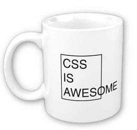
In closing, CSS can be great...when it is doing what you want. I think this mug sums it up for me:

The design of the modals was fairly straightforward. I'm getting more comfortable with CSS and have a better understanding of how it works. For instance, if you want to override the layout of a component (say a modal-header), then, in a CSS stylesheet, you can do
.modal-header{
//layout changes here
}
and redesign the color, layout, etc. of all the modal headers in the application. This is very handy for application wide-changes. If, however, you only want to affect particular modals (say, you want the header to have blue text for certain modals), then you could create another class by doing
.modal-blue-header{
color: blue;
}
and then append this class to the modal header class in the Haml view code:
.modal-header.modal-blue-header
This makes it very easy to only change specific components or maybe make small modifications to components while still keeping an overall general theme (such as keeping a button the same color but changing its size).
I've also discovered the wonderful world of link styling in CSS. Additions to a class, such as :hover, can help customize the appears of links and button clicks, which comes in very handy. However, trying to get CSS to format a webpage nicely for different size screens can be a real annoyance. Every-time I make modifications to a page's design, I use the Chrome Emulator to test the display of the screen on a phone or tablet screen resolution and then do my best to make modifications to the CSS using the "@media" tag to create different styles for smaller screens. Overall, trying to get the components to display nicely on a small screen is a real challenge and you can't always make the page look as nice as you'd want. There are also some cases, such as with the tables display for the challenges page, where responsive CSS has some sizes where the styling just doesn't seem to want to cooperate, no matter what changes I make. I plan to continue testing the app at various screen resolutions so that, in general, it will look decent on a wide variety of resolutions.
In closing, CSS can be great...when it is doing what you want. I think this mug sums it up for me:
Friday, April 11, 2014
Cookies!
This morning I was trying to get a simple task done--display a message to the user when they have completed a week of the challenge. However, it turned out to be a little more complicated than I thought due to the fact that I had to save the number of the last week displayed as well as boolean which would be true if the modal with the message had been displayed and false otherwise. In a regular application (using Java for example), you could save these values somewhat persistently as static variables (or serialize them for more permanent storage). However, since this is a web application, every time a page reload occurs, the variables in the Javascript code would get reinitialized and nothing would work. After some googling, I found that there was a handy jQuery Javascript file called jquery.cookie.js that could be be used to store variables persistently as cookies. A value can be saved by calling
$.cookie("nameThisVariable", "some value");
and then could be accessed by calling
var thisVar = $.cookie("nameThisVariable");
This allowed me to store the two values I needed to ensure that the message was only displayed once a week was complete and would not be redisplayed when the user reloaded the page.
Another task I tackled this morning was figuring out how to tell the user (once they had completed a week) when they could start checking in again (since our website only allows so many check-ins per week and once you complete your check-ins for the week, you cannot check-in until next week). Getting the time itself was easy because this is stored in our Week model. However, it has been trickier to figure out how to format the time based on time zone. By default, the timestamp is returned from Rails as UTC, which is not very user friendly. I then used the "in_time_zone" Ruby function to convert UTC time to MST explicitly. However, if we have users on central time, pacific time, eastern time, etc., this will not work. I will have to look into using Devise to get the user's timezone when they sign up so that we can then tailor the time display to the user's current timezone.
$.cookie("nameThisVariable", "some value");
and then could be accessed by calling
var thisVar = $.cookie("nameThisVariable");
This allowed me to store the two values I needed to ensure that the message was only displayed once a week was complete and would not be redisplayed when the user reloaded the page.
Another task I tackled this morning was figuring out how to tell the user (once they had completed a week) when they could start checking in again (since our website only allows so many check-ins per week and once you complete your check-ins for the week, you cannot check-in until next week). Getting the time itself was easy because this is stored in our Week model. However, it has been trickier to figure out how to format the time based on time zone. By default, the timestamp is returned from Rails as UTC, which is not very user friendly. I then used the "in_time_zone" Ruby function to convert UTC time to MST explicitly. However, if we have users on central time, pacific time, eastern time, etc., this will not work. I will have to look into using Devise to get the user's timezone when they sign up so that we can then tailor the time display to the user's current timezone.
Wednesday, April 9, 2014
Profile page design and meeting
I have been working on getting the statistics for the user's profile page redesigned to match the color scheme and design for the rest of the site. I added a progress bar to each statistic display which will (eventually) show exactly how many points the user has toward completing the next level of a given statistic. I also discovered that spans nested in divs can be very useful for arranging items horizontally, though you do have to do some tweaking of widths and heights to make sure they are all vertically aligned and nicely spaced horizontally.
I have also been testing the layout of the redesigned pages using the phone emulator in Google Chrome, which is extremely handy for testing. This revealed some issues with both the home page and profile page layout that I was able to fix. I've tried to make it a habit to run the emulator every time I make a change to the CSS just to make sure it still looks good on a small screen.
Fernando and I were able to find some appropriate icons to use for the levels. At the last team meeting we made some changes to the statistic names because Fernando discovered that Altruism only applied to one of the challenges that we had and Willpower applied to all of them. Thus we changed these to Dietetic/Diet and Dexterity since these are not too general and not too specific. However, at the client meeting today, Prof. Ackley pointed out that having Altruism might be seen as a good thing since eliminating it might cause some criticism that our focus is too narcissistic.
The client meeting itself helped solidify most of our tasks for the next two weeks. Most important, in my opinion, is design. Fernando has worked on putting in some icons to represent each statistic so once we get the progress bar for each statistic working, this page will mostly be complete design-wise. We will need to added some more logic to the progress bar, however, in order to give the user more feedback on their progress (like displaying a modal when they complete a week).
Additionally, the challenges page will need to designed this week as well since it is our other "main" page. Hopefully Fernando and I can get some help on this from Matt F. since otherwise it might be very difficult to get this done before next week, given that we have other coding and design to do for the rest of the site.
I have also been testing the layout of the redesigned pages using the phone emulator in Google Chrome, which is extremely handy for testing. This revealed some issues with both the home page and profile page layout that I was able to fix. I've tried to make it a habit to run the emulator every time I make a change to the CSS just to make sure it still looks good on a small screen.
Fernando and I were able to find some appropriate icons to use for the levels. At the last team meeting we made some changes to the statistic names because Fernando discovered that Altruism only applied to one of the challenges that we had and Willpower applied to all of them. Thus we changed these to Dietetic/Diet and Dexterity since these are not too general and not too specific. However, at the client meeting today, Prof. Ackley pointed out that having Altruism might be seen as a good thing since eliminating it might cause some criticism that our focus is too narcissistic.
The client meeting itself helped solidify most of our tasks for the next two weeks. Most important, in my opinion, is design. Fernando has worked on putting in some icons to represent each statistic so once we get the progress bar for each statistic working, this page will mostly be complete design-wise. We will need to added some more logic to the progress bar, however, in order to give the user more feedback on their progress (like displaying a modal when they complete a week).
Additionally, the challenges page will need to designed this week as well since it is our other "main" page. Hopefully Fernando and I can get some help on this from Matt F. since otherwise it might be very difficult to get this done before next week, given that we have other coding and design to do for the rest of the site.
Subscribe to:
Posts (Atom)