After the client meeting last week, Fernando and I wrote down the notes we took at the meeting and put them in a google doc. These notes essentially encompass the final design and functionality tweaks that need to be made in the next week or so. I've been trying to get as many done as I can (and adding any additional tasks as they crop up), particularly those related to design of the Challenges page (and My Challenges, which lists all challenges created by a user, and View All, which lists all the challenges for a particular category), the modals, and the current-challenge bar. I was able to get the design of the Challenges and My Challenges page mostly done. I also added some functionality to the View All page, allowing the user to take a challenge from this page.
The design of the modals was fairly straightforward. I'm getting more comfortable with CSS and have a better understanding of how it works. For instance, if you want to override the layout of a component (say a modal-header), then, in a CSS stylesheet, you can do
.modal-header{
//layout changes here
}
and redesign the color, layout, etc. of all the modal headers in the application. This is very handy for application wide-changes. If, however, you only want to affect particular modals (say, you want the header to have blue text for certain modals), then you could create another class by doing
.modal-blue-header{
color: blue;
}
and then append this class to the modal header class in the Haml view code:
.modal-header.modal-blue-header
This makes it very easy to only change specific components or maybe make small modifications to components while still keeping an overall general theme (such as keeping a button the same color but changing its size).
I've also discovered the wonderful world of link styling in CSS. Additions to a class, such as :hover, can help customize the appears of links and button clicks, which comes in very handy. However, trying to get CSS to format a webpage nicely for different size screens can be a real annoyance. Every-time I make modifications to a page's design, I use the Chrome Emulator to test the display of the screen on a phone or tablet screen resolution and then do my best to make modifications to the CSS using the "@media" tag to create different styles for smaller screens. Overall, trying to get the components to display nicely on a small screen is a real challenge and you can't always make the page look as nice as you'd want. There are also some cases, such as with the tables display for the challenges page, where responsive CSS has some sizes where the styling just doesn't seem to want to cooperate, no matter what changes I make. I plan to continue testing the app at various screen resolutions so that, in general, it will look decent on a wide variety of resolutions.
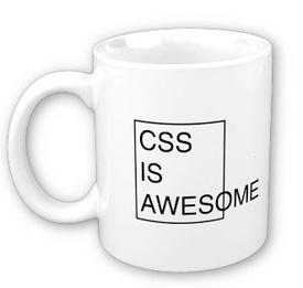
In closing, CSS can be great...when it is doing what you want. I think this mug sums it up for me:

No comments:
Post a Comment